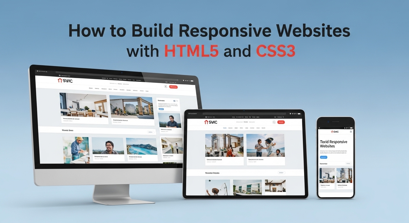
Building responsive websites with HTML5 and CSS3 has become essential in today’s mobile-first world. With over 58% of web traffic coming from mobile devices, creating websites that adapt seamlessly across all screen sizes isn’t just beneficial—it’s critical for success.
Have you ever wondered what makes a website truly responsive? Let’s explore this journey together, starting with what you might already know about web development.
Understanding the Foundation of Responsive Design
What comes to mind when you think about responsive web design? At its core, responsive design ensures your website provides an optimal viewing experience across a wide range of devices, from desktop computers to smartphones and tablets.
The foundation rests on three key principles:
- Flexible Grids: Using relative units like percentages instead of fixed pixels allows your layout to adapt to different screen sizes.
- Flexible Images: Images that scale proportionally prevent layout breaks and ensure visual harmony across devices.
- Media Queries: CSS3 media queries enable you to apply different styles based on device characteristics like screen width, height, and resolution.
Consider how your favorite websites behave when you resize your browser window. Notice how content reflows, images scale, and navigation elements might transform into mobile-friendly hamburger menus?
Essential HTML5 Structure for Responsive Websites
Before diving into CSS3 techniques, let’s establish the proper HTML5 foundation for responsive websites with HTML5 and CSS3:
<!DOCTYPE html>
<html lang="en">
<head>
    <meta charset="UTF-8">
    <meta name="viewport" content="width=device-width, initial-scale=1.0">
    <title>Responsive Website</title>
    <link rel="stylesheet" href="styles.css">
</head>
<body>
    <header>
        <nav>
            <!-- Navigation content -->
        </nav>
    </header>
    <main>
        <!-- Main content -->
    </main>
    <footer>
        <!-- Footer content -->
    </footer>
</body>
</html>
The viewport meta tag is crucial—it tells browsers how to control the page’s dimensions and scaling. Without it, mobile browsers display pages at desktop widths, forcing users to pinch and zoom.
CSS3 Media Queries: Your Responsive Design Toolkit
Media queries form the backbone of responsive design. They allow you to apply CSS rules conditionally based on device characteristics. Here’s how to implement effective media query strategies:
Mobile-First Approach
Start with mobile styles as your base, then enhance for larger screens:
/* Mobile styles (base) */
.container {
    width: 100%;
    padding: 10px;
}

/* Tablet styles */
@media screen and (min-width: 768px) {
    .container {
        max-width: 750px;
        margin: 0 auto;
        padding: 20px;
    }
}

/* Desktop styles */
@media screen and (min-width: 1024px) {
    .container {
        max-width: 1200px;
        padding: 30px;
    }
}
Common Breakpoints for Responsive Design
| Device | Screen Width | Media Query |
|---|---|---|
| Mobile | 320px – 767px | Base styles |
| Tablet | 768px – 1023px | @media (min-width: 768px) |
| Desktop | 1024px+ | @media (min-width: 1024px) |
| Large Desktop | 1200px+ | @media (min-width: 1200px) |
Think about your target audience—which devices do they primarily use? This insight helps you prioritize which breakpoints deserve the most attention.
Flexbox: Creating Flexible Layouts
CSS3 Flexbox revolutionizes how we create responsive layouts. It provides efficient ways to arrange, distribute, and align elements within containers.
Basic Flexbox Implementation
.flex-container {
    display: flex;
    flex-wrap: wrap;
    justify-content: space-between;
    align-items: center;
}

.flex-item {
    flex: 1;
    min-width: 250px;
    margin: 10px;
}
Responsive Navigation with Flexbox
.nav-container {
    display: flex;
    justify-content: space-between;
    align-items: center;
    flex-wrap: wrap;
}

.nav-menu {
    display: flex;
    list-style: none;
    gap: 20px;
}

@media (max-width: 767px) {
    .nav-menu {
        flex-direction: column;
        width: 100%;
        margin-top: 20px;
    }
}
How might you adapt this navigation pattern for your specific project needs? Consider the number of menu items and their importance hierarchy.
CSS Grid: Advanced Layout Control
CSS Grid provides two-dimensional layout control, perfect for complex responsive designs. Here’s how to leverage grid for responsive websites with HTML5 and CSS3:
Basic Grid Setup
.grid-container {
    display: grid;
    grid-template-columns: repeat(auto-fit, minmax(300px, 1fr));
    gap: 20px;
    padding: 20px;
}

.grid-item {
    background: #f0f0f0;
    padding: 20px;
    border-radius: 8px;
}
Responsive Grid Layouts
.main-layout {
    display: grid;
    grid-template-areas:
        "header header header"
        "nav content sidebar"
        "footer footer footer";
    grid-template-columns: 200px 1fr 200px;
    grid-template-rows: auto 1fr auto;
    min-height: 100vh;
}

@media (max-width: 768px) {
    .main-layout {
        grid-template-areas:
            "header"
            "nav"
            "content"
            "sidebar"
            "footer";
        grid-template-columns: 1fr;
    }
}
Images and Media: Responsive Best Practices
Images often break responsive layouts. Here are proven techniques for handling media responsively:
Responsive Images with HTML5
<picture>
    <source media="(min-width: 768px)" srcset="large-image.jpg">
    <source media="(min-width: 480px)" srcset="medium-image.jpg">
    <img src="small-image.jpg" alt="Responsive image">
</picture>
CSS Techniques for Flexible Media
img, video, embed, object {
    max-width: 100%;
    height: auto;
}

.responsive-video {
    position: relative;
    padding-bottom: 56.25%; /* 16:9 aspect ratio */
    height: 0;
    overflow: hidden;
}

.responsive-video iframe {
    position: absolute;
    top: 0;
    left: 0;
    width: 100%;
    height: 100%;
}
What types of media does your project include? Consider how each element should behave across different screen sizes.
Typography That Scales
Responsive typography ensures readability across all devices. Use relative units and modern CSS features:
Fluid Typography with CSS3
/* Base typography */
body {
    font-family: 'Arial', sans-serif;
    font-size: 16px;
    line-height: 1.6;
}

/* Fluid typography using clamp() */
h1 {
    font-size: clamp(1.5rem, 4vw, 3rem);
}

h2 {
    font-size: clamp(1.25rem, 3vw, 2.5rem);
}

p {
    font-size: clamp(1rem, 2.5vw, 1.125rem);
    max-width: 65ch; /* Optimal reading width */
}
Responsive Typography Scale
Create a consistent typographic hierarchy that adapts to screen size:
.text-scale-1 { font-size: clamp(2.5rem, 5vw, 4rem); }
.text-scale-2 { font-size: clamp(2rem, 4vw, 3rem); }
.text-scale-3 { font-size: clamp(1.5rem, 3vw, 2rem); }
.text-scale-4 { font-size: clamp(1.25rem, 2.5vw, 1.5rem); }
.text-scale-5 { font-size: clamp(1rem, 2vw, 1.25rem); }
Testing and Optimization Strategies
Building responsive websites with HTML5 and CSS3 requires thorough testing. Here’s your testing checklist:
Browser Testing Approach
Test across major browsers and devices:
- Chrome, Firefox, Safari, Edge
- iOS Safari, Android Chrome
- Various screen resolutions and orientations
Performance Optimization
/* Optimize animations for mobile */
@media (prefers-reduced-motion: reduce) {
    * {
        animation-duration: 0.01ms !important;
        animation-iteration-count: 1 !important;
        transition-duration: 0.01ms !important;
    }
}

/* Hardware acceleration for smooth animations */
.animated-element {
    transform: translateZ(0);
    will-change: transform;
}
Useful Testing Tools
Consider using these resources for testing and optimization:
- Chrome DevTools for device simulation
- BrowserStack for cross-browser testing
- PageSpeed Insights for performance analysis
- Responsive Design Checker for quick responsive testing
Common Pitfalls and Solutions
Learning from common mistakes accelerates your responsive design journey:
Fixed Width Containers
Problem: Using fixed pixel widths Solution: Use percentage or viewport units
/* Avoid */
.container { width: 1200px; }

/* Better */
.container {
    max-width: 1200px;
    width: 100%;
    margin: 0 auto;
}
Neglecting Touch Interfaces
Problem: Small click targets on mobile Solution: Ensure minimum 44px touch targets
.button, .link {
    min-height: 44px;
    min-width: 44px;
    padding: 12px 20px;
}
Advanced Responsive Techniques
As you master the basics, explore these advanced concepts:
Container Queries (Future CSS)
@container (min-width: 400px) {
    .card {
        display: flex;
        flex-direction: row;
    }
}
CSS Custom Properties for Responsive Design
:root {
    --spacing-small: clamp(0.5rem, 2vw, 1rem);
    --spacing-medium: clamp(1rem, 4vw, 2rem);
    --spacing-large: clamp(2rem, 6vw, 4rem);
}

.section {
    padding: var(--spacing-medium);
}
Putting It All Together
How confident do you feel about implementing these responsive design techniques? Start with a simple project—perhaps a personal portfolio or blog layout—and gradually incorporate these methods.
Remember that building responsive websites with HTML5 and CSS3 is an iterative process. Begin with mobile-first design, test frequently across devices, and refine based on user feedback and performance metrics.
Consider creating a checklist for your responsive design projects:
- Viewport meta tag implemented
- Mobile-first CSS approach
- Flexible grid system
- Responsive images and media
- Touch-friendly interface elements
- Cross-browser testing completed
- Performance optimization applied
What aspect of responsive design interests you most? Whether it’s mastering CSS Grid, perfecting mobile navigation, or optimizing performance, each skill builds upon the foundation we’ve established.
The future of web development increasingly demands responsive expertise. By mastering these HTML5 and CSS3 techniques, you’re building skills that will serve you well as web technologies continue evolving. Start implementing these techniques today, and watch your websites transform into seamless, device-agnostic experiences that delight users regardless of how they access your content.


