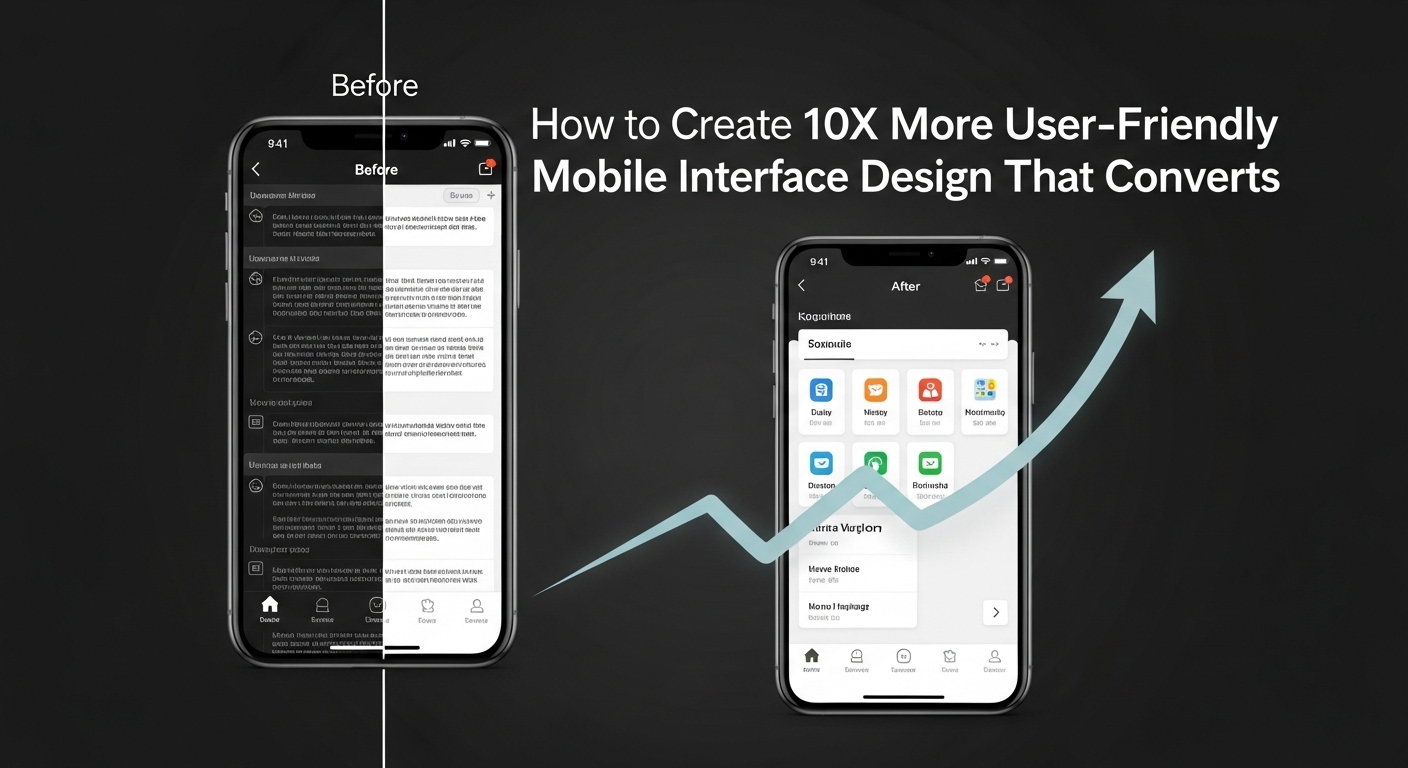
Mobile interface design has become the cornerstone of digital success in today’s smartphone-dominated world. With over 6.8 billion mobile users worldwide, creating intuitive and user-friendly mobile interfaces isn’t just important—it’s essential for business survival.
Whether you’re designing a mobile app or optimizing a website for mobile devices, understanding the fundamentals of mobile interface design can dramatically impact user engagement, conversion rates, and overall business performance.
Understanding Mobile Interface Design Fundamentals
Mobile interface design refers to the process of creating digital interfaces specifically optimized for mobile devices. Unlike desktop interfaces, mobile design requires unique considerations due to smaller screen sizes, touch-based interactions, and varying usage contexts.
The primary goal of effective mobile interface design is to deliver seamless user experiences that feel natural and intuitive on mobile devices. This involves careful consideration of visual hierarchy, touch targets, navigation patterns, and content organization.
Key Differences Between Mobile and Desktop Design
Aspect | Mobile Design | Desktop Design |
Screen Size | 3.5-6.9 inches | 13+ inches |
Interaction Method | Touch gestures | Mouse and keyboard |
Context of Use | On-the-go, distracted | Focused, stationary |
Attention Span | 8-15 seconds | 15-30 seconds |
Loading Speed | Critical (3G/4G) | Less critical (WiFi) |
Strategy 1: Prioritize Touch-Friendly Design Elements
Creating user-friendly mobile interfaces starts with understanding how people interact with mobile devices. Touch-based interactions require larger target areas and different spacing considerations than traditional desktop interfaces.
Optimal Touch Target Sizes
The ideal touch target size for mobile interface design is minimum 44×44 pixels, as recommended by Apple’s Human Interface Guidelines. However, research suggests that 48×48 pixels provides better usability across different finger sizes.
Consider these touch-friendly design principles:
- Adequate spacing: Maintain at least 8-10 pixels between interactive elements
- Visual feedback: Provide immediate visual responses to touch interactions
- Gesture support: Incorporate common mobile gestures like swipe, pinch, and long-press
- Thumb-friendly navigation: Place frequently used elements within comfortable thumb reach
For detailed guidelines on touch target sizing, refer to Google’s Material Design specifications.
Strategy 2: Implement Progressive Disclosure in Mobile Interface Design
Progressive disclosure is a technique that presents information in manageable chunks, reducing cognitive load and improving user experience. This approach is particularly effective in mobile interface design where screen real estate is limited.
Effective Progressive Disclosure Techniques
- Accordion Menus: Allow users to expand sections of interest while keeping the interface clean and organized.
- Tab Navigation: Group related content into easily accessible tabs without overwhelming the main interface.
- Modal Windows: Present secondary information or actions in overlay windows that don’t navigate away from the main content.
- Step-by-Step Processes: Break complex tasks into smaller, manageable steps with clear progress indicators.
Strategy 3: Optimize Navigation for Mobile User Experience
Navigation is the backbone of user-friendly mobile interfaces. Poor navigation can frustrate users and lead to high bounce rates, while intuitive navigation enhances user satisfaction and engagement.
Popular Mobile Navigation Patterns
- Bottom Tab Navigation: Places primary navigation at the bottom of the screen for easy thumb access. This pattern works exceptionally well for apps with 3-5 main sections.
- Hamburger Menu: Conceals navigation behind a menu icon to save space. While controversial, it’s effective when implemented thoughtfully with clear labeling.
- Tab Bar: Displays all main navigation options simultaneously, providing quick access to different sections.
- Gesture-Based Navigation: Utilizes swipe gestures for navigation, popular in modern smartphones and progressive web applications.
Learn more about mobile navigation best practices from Nielsen Norman Group’s research.
Strategy 4: Enhance Visual Hierarchy and Typography
Visual hierarchy guides users through your mobile interface design, directing attention to the most important elements first. Effective typography ensures readability across various mobile devices and screen sizes.
Typography Best Practices for Mobile
- Minimum font size: Use 16px for body text to ensure readability without zooming
- Line spacing: Maintain 1.4-1.6 line height for optimal readability
- Contrast ratio: Ensure at least 4.5:1 contrast ratio between text and background
- Font selection: Choose web-safe fonts that load quickly and render well on mobile devices
Creating Effective Visual Hierarchy
- Size differentiation: Use significantly different font sizes for headings and body text
- Color emphasis: Apply brand colors strategically to highlight important elements
- White space utilization: Leverage white space to create visual breathing room
- Consistent styling: Maintain consistent typography patterns throughout the interface
Strategy 5: Optimize Loading Speed and Performance
Speed is crucial in mobile interface design. Users expect mobile interfaces to load within 2-3 seconds, and delays beyond this threshold significantly impact user satisfaction and conversion rates.
Performance Optimization Techniques
- Image Optimization: Compress images using modern formats like WebP and implement lazy loading for off-screen images.
- Minimize HTTP Requests: Combine CSS and JavaScript files to reduce server requests and improve loading times.
- Implement Caching: Utilize browser caching and service workers to store frequently accessed resources locally.
- Progressive Loading: Load critical content first, then progressively load secondary elements as needed.
For comprehensive performance optimization strategies, consult Google PageSpeed Insights for detailed recommendations.
Strategy 6: Design for Accessibility and Inclusivity
Accessible mobile interface design ensures your digital products work for users with diverse abilities and needs. This approach not only expands your audience but often improves usability for all users.
Essential Accessibility Features
Feature | Purpose | Implementation |
Alt Text | Screen reader support | Descriptive text for images |
Color Contrast | Visual impairment support | Minimum 4.5:1 ratio |
Voice Control | Motor impairment support | Voice navigation options |
Text Scaling | Vision support | Scalable font sizes |
Focus Indicators | Keyboard navigation | Visible focus states |
Testing for Accessibility
Regular accessibility testing should be integral to your mobile interface design process. Use tools like:
- Screen readers (VoiceOver for iOS, TalkBack for Android)
- Color contrast analyzers
- Keyboard-only navigation testing
- Voice control testing
Strategy 7: Implement User Testing and Iterative Design
The most successful mobile interface design projects incorporate continuous user feedback and iterative improvements. User testing reveals real-world usage patterns that may not be apparent during the design phase.
Effective User Testing Methods
- Moderated Usability Testing: Observe users interacting with your mobile interface in real-time, allowing for immediate clarification and deeper insights.
- A/B Testing: Compare different versions of interface elements to determine which performs better with your target audience.
- Heat Map Analysis: Understand how users interact with your mobile interface by analyzing touch patterns and scroll behavior.
- Analytics Review: Regularly analyze user behavior data to identify pain points and optimization opportunities.
Key Metrics to Track
- Task completion rates: Percentage of users successfully completing primary tasks
- Time to completion: Average time required to complete key user journeys
- Error rates: Frequency of user errors and interface confusion points
- User satisfaction scores: Subjective feedback on interface usability and appeal
Advanced Mobile Interface Design Considerations
Micro-Interactions and Animation
Thoughtful micro-interactions enhance user experience by providing feedback, guiding attention, and creating delightful moments within your mobile interface design. However, animations should serve functional purposes rather than being purely decorative.
Effective Animation Guidelines:
- Keep animations under 300ms for UI transitions
- Use easing functions that feel natural and responsive
- Provide clear visual feedback for user actions
- Ensure animations don’t interfere with usability
Context-Aware Design
Modern mobile interface design should adapt to user context, including location, time of day, device orientation, and usage patterns. Context-aware interfaces provide more relevant and personalized experiences.
Cross-Platform Consistency
While respecting platform-specific conventions (iOS vs. Android), maintain brand consistency across different mobile platforms. This balance ensures users feel comfortable while preserving your brand identity.
Common Mobile Interface Design Mistakes to Avoid
Understanding common pitfalls helps create more effective user-friendly mobile interfaces:
- Overcrowded interfaces: Cramming too much information onto small screens
- Inconsistent navigation: Changing navigation patterns between screens
- Ignoring thumb zones: Placing important elements outside comfortable reach
- Poor error handling: Failing to provide clear, actionable error messages
- Neglecting offline scenarios: Not designing for poor connectivity situations
Future Trends in Mobile Interface Design
Stay ahead by understanding emerging trends:
- Voice user interfaces: Integration of voice commands and audio feedback
- Augmented reality interfaces: Blending digital elements with real-world environments
- Gesture-based navigation: Reducing reliance on visible UI elements
- Adaptive interfaces: AI-powered personalization based on user behavior
- Sustainable design: Optimizing interfaces for energy efficiency and reduced data usage
Tools and Resources for Mobile Interface Design
Design Tools
- Figma: Collaborative interface design with mobile-specific features
- Sketch: Popular Mac-based design tool with extensive mobile UI kits
- Adobe XD: Comprehensive design and prototyping platform
Testing Tools
- BrowserStack: Cross-device testing platform
- UserTesting: Remote user testing service
- Hotjar: Heat mapping and user behavior analytics
Development Resources
- React Native: Cross-platform mobile development framework
- Flutter: Google’s UI toolkit for mobile applications
- Ionic: Hybrid mobile app development platform
For additional resources, explore Smashing Magazine’s mobile design section for the latest insights and techniques.
Conclusion
Creating user-friendly mobile interfaces requires a comprehensive understanding of user behavior, technical constraints, and design principles. By implementing these seven essential strategies—prioritizing touch-friendly design, utilizing progressive disclosure, optimizing navigation, enhancing visual hierarchy, improving performance, designing for accessibility, and conducting continuous user testing—you can create mobile interface designs that truly serve your users’ needs.
Successful mobile interface design is an iterative process. Regularly analyze user feedback, monitor performance metrics, and stay updated with evolving design trends and technologies. The investment in thoughtful mobile interface design pays dividends through improved user satisfaction, higher conversion rates, and stronger brand loyalty.
As mobile technology continues advancing, the principles outlined in this guide will help you create interfaces that not only meet current user expectations but also adapt to future innovations in mobile interaction design.